BRAND IDENTITY + WEB DESIGN
ABOUT THE COMPANY:
A small team (a pharmacist, a former collegiate athlete, and a wellness fanatic) came to me in Fall 2019 and said, “We need a logo. We’re launching a supplement company. Oh, and we need a name too.”
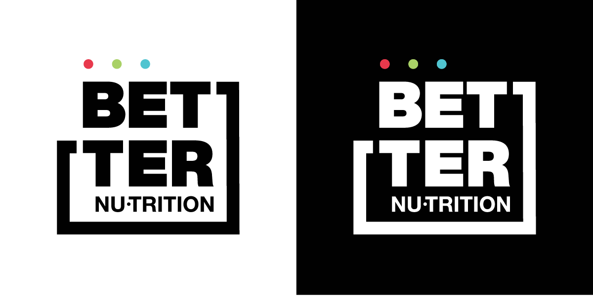
One logo, two websites, five (and counting) products, and a plethora of marketing collateral items later — BETTER NU.trition was born.
Better Nu’s mission is simple: to help you and your family live BETTER.
Did you know 90% of Americans are deficient in at least one vitamin or mineral. No matter what your diet is, it’s almost impossible to retain them all daily. Better Nu works through targeted supplementation to replenish these necessary vitamins & minerals.
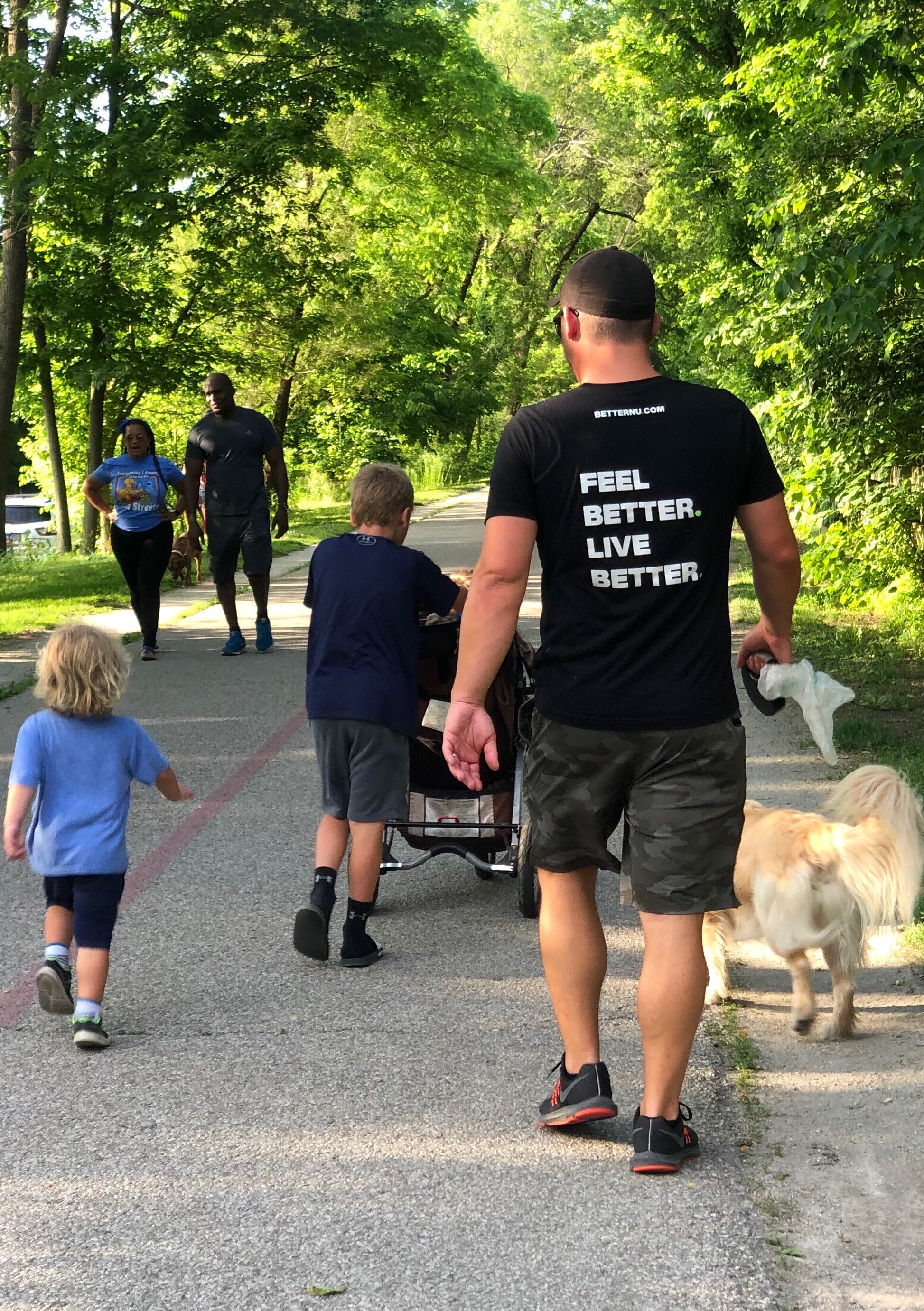
Feel BETTER. Live BETTER.
The best part? They appeal to kids and families as well. We all know how important vitamins are for growing kids (and how hard it is to get kids to eat things). That’s why this team of 3 dads developed a liquid absorption option — that you can easily drop into their water or juice in the morning.
Kid Tested. Father Invented.
—
THE PROJECT:
When discussing the brand, we talked often about how saturated the vitamin & supplement industry is. Let’s be honest, it’s the hot trend right now. So how did this company distinguish themselves? What, in an industry of thousands, was going to make them stand apart? We kept talking about how it was BETTER. The ingredients they use, the method of liquid absorption versus caplets, the results—it was all…. BETTER. And thus, we had the name.
Okay, but how do we make it visually stand out? In my industry research, we looked at as many vitamin & supplement companies as we could find, and noticed one thing: they all had nice, clean designs, but… they all looked the same. A collage-like layout to the websites, muted neutral tones, lots of white space.
So how do we stand out?
We go dark, bold, and in your face. I developed a color palette focused on primarily black & white contrast with pops of color. The colors would each represent different product lines:
RED the party animal: hangover remedies & overall liver support
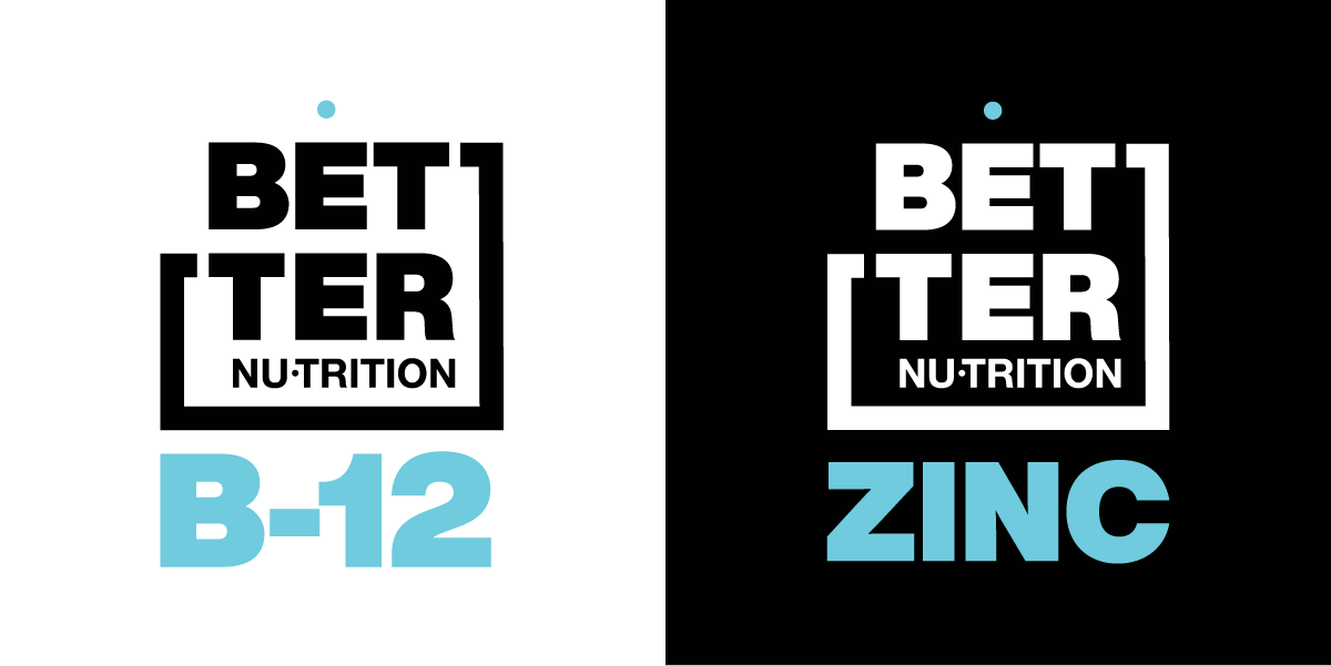
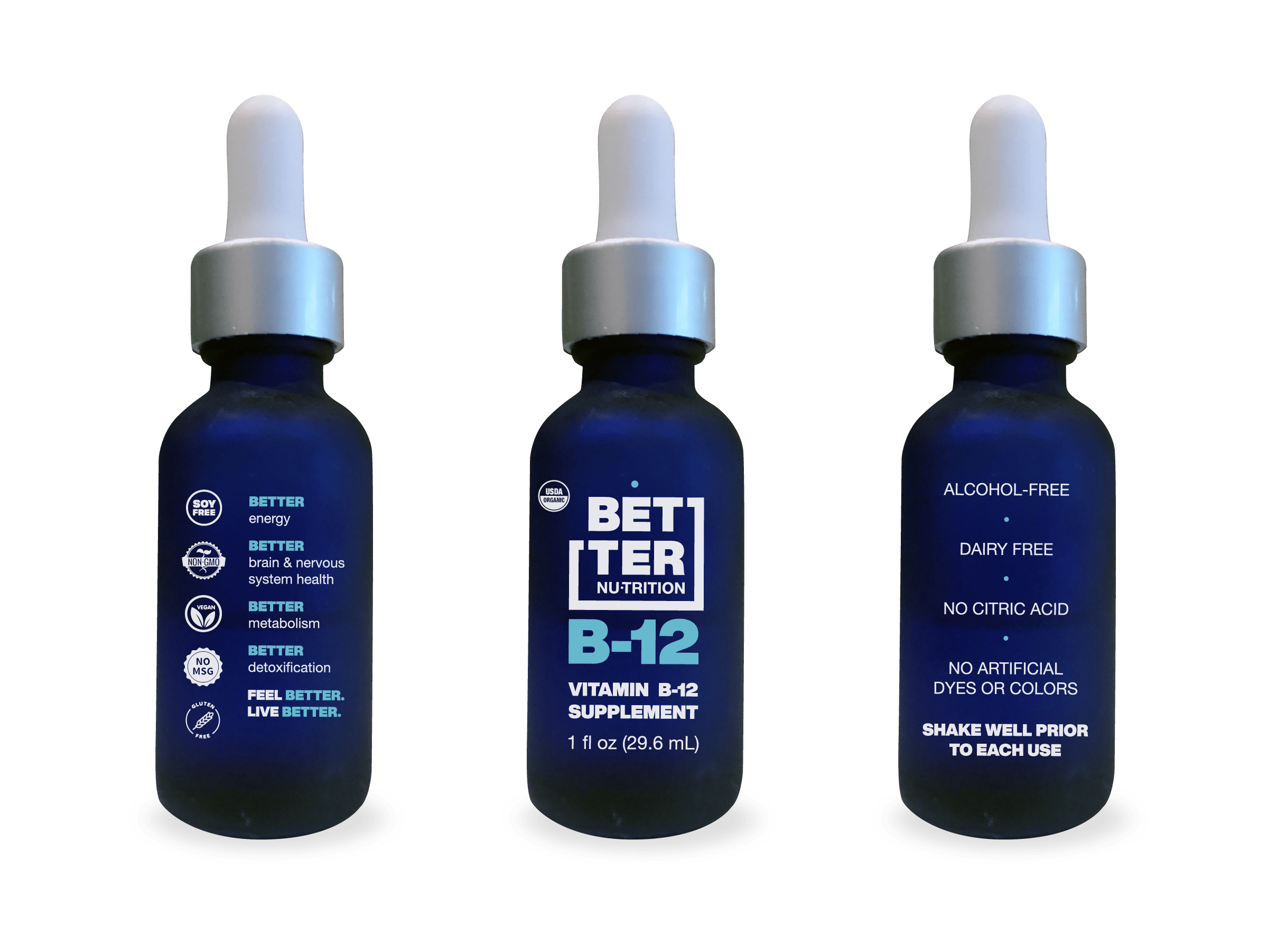
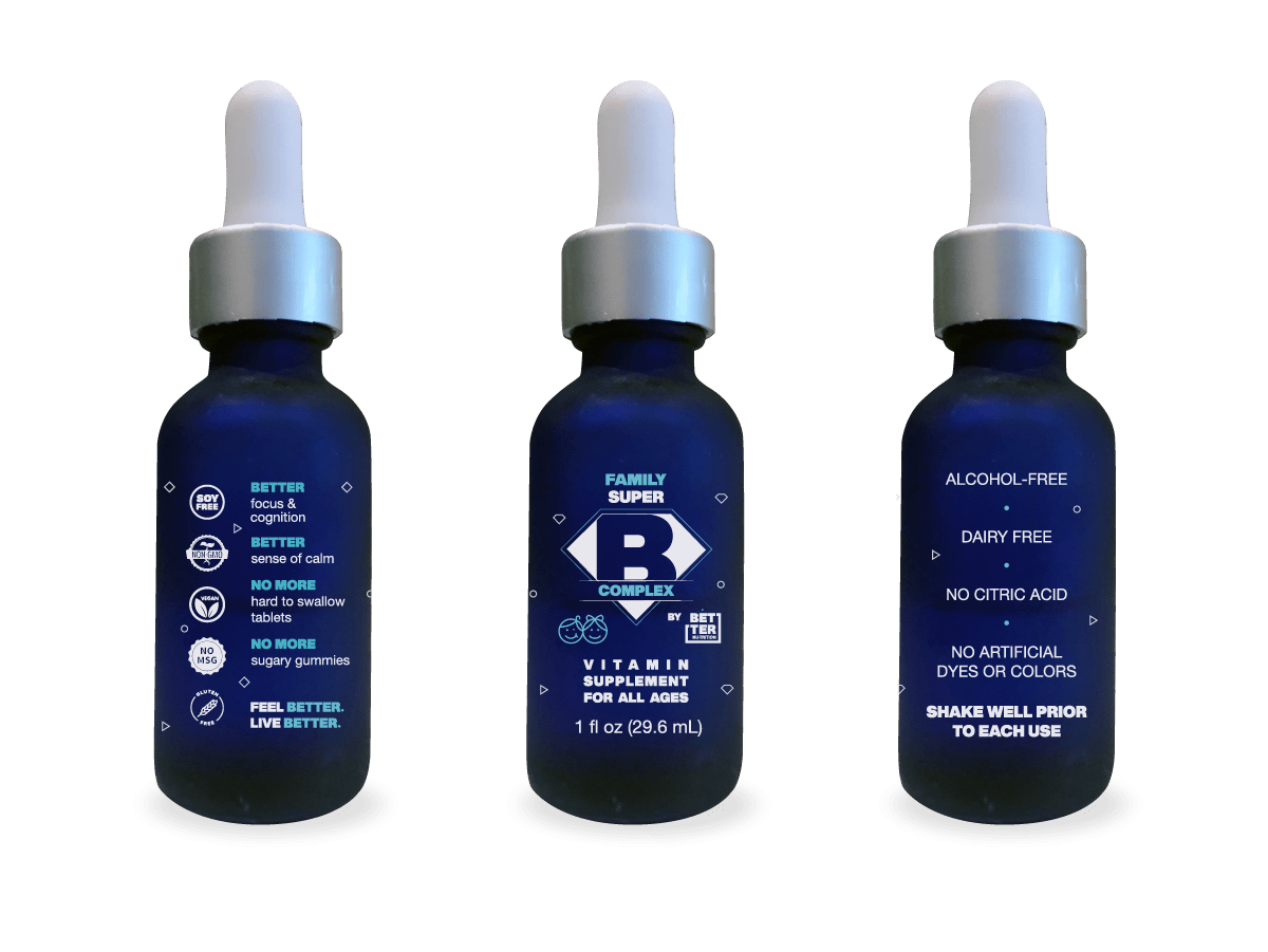
BLUE the fam: these products are safe for the whole family, from kids to seniors
GREEN the athlete: these are primarily focused on muscle recovery and hydration for everyone from the workout enthusiast to the professional athlete
From this color system, we developed an adaptive branding system for the product packaging where ONLY the dot corresponding with the product line would appear above the logo on the respective products.
We transitioned this color code to the website as well, coloring all links and interactive elements respectively associated with each product. For any interactive element not specifically associated with a product, we alternated the color usage in this order: red, blue, green.
We are set to launch at the end of Summer 2020 and I’m so excited to see how this brand takes off.
betternu.com ⟶
